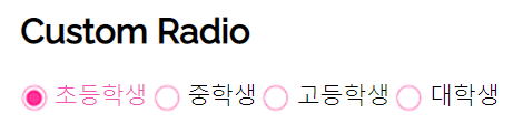
- radio 버튼
동일한 name값을 가져야 다중 선택이 가능함
- custom radio button : 배경이미지 이용 ( background: url(img/....jpg) )
백그라운드이미지를 왼쪽 오른쪽으로 이동시킴
|
1
2
3
4
5
6
7
8
9
10
11
|
<div class="grade">
<h2>Custom Radio</h2>
<input type="radio" name="grade" id="grade-chk1">
<label for="grade-chk1"><em></em>초등학생</label>
<input type="radio" name="grade" id="grade-chk2">
<label for="grade-chk2"><em></em>중학생</label>
<input type="radio" name="grade" id="grade-chk3">
<label for="grade-chk3"><em></em>고등학생</label>
<input type="radio" name="grade" id="grade-chk4">
<label for="grade-chk4"><em></em>대학생</label>
</div>
|
cs |
|
1
2
3
4
5
6
7
8
9
10
11
12
13
14
15
16
17
18
19
20
21
|
.grade input[name=grade] {
display: none;
}
.grade label {
cursor: pointer;
}
.grade label em {
/* border: 1px solid red; */
display: inline-block;
width: 18px;
height: 18px;
vertical-align: middle;
margin-right: 5px;
background: url(../img/check/radio-01.png) no-repeat left center;
}
.grade input[type=radio]:checked + label em {
background-position: right center;
}
.grade input[type=radio]:checked + label {
color: #f156b6;
}
|
cs |
- custom checkbox: 폰트어썸 4.7 이용
before after : input 요소에는 사용할 수 없음
label:before
active : 마우스를 눌렀다가 떼지 않은 상태
|
1
2
3
4
5
6
7
8
9
10
|
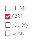
<form action="">
<input type="checkbox" id="chk1" checked>
<label for="chk1">HTML</label>
<input type="checkbox" id="chk2">
<label for="chk2">CSS</label>
<input type="checkbox" id="chk3">
<label for="chk3">jQuery</label>
<input type="checkbox" id="chk4">
<label for="chk4">UIKit</label>
</form>
|
cs |
|
1
2
3
4
5
6
7
8
9
10
11
12
13
14
15
16
17
18
19
20
21
22
23
24
25
26
27
28
29
30
31
32
33
34
35
36
37
38
39
40
41
42
43
|
/* 폰트어썸 4.7 */
@import url('https://stackpath.bootstrapcdn.com/font-awesome/4.7.0/css/font-awesome.min.css');
form input[type=checkbox] {
display: none;
}
form label {
display: block;
width: 150px;
}
/*
아이콘 유니코드로 content에 넣기
font-family를 폰트어썸으로 해야함(필수)
fontsize로 아이콘 사이즈 조절
*/
form label:before {
content: '\f00c';
font-family: fontawesome;
display: inline-block;
width: 14px;
height: 14px;
line-height: 14px;
border: 1px solid #333;
border-radius: 3px;
margin-right: 5px;
text-align: center;
vertical-align: middle;
font-size: 13px;
transition: 0.3s;
color: transparent;
}
form input[type=checkbox]:checked + label:before {
background-color: crimson;
color: #fff;
border-color: transparent;
}
/* scale(0) 으로 없어졌다가 나타나는 느낌 */ form input[type=checkbox] + label:active:before {
transform: scale(0);
}
|
cs |
'Web > HTML CSS 퍼블리싱' 카테고리의 다른 글
| full screen 검색창 (0) | 2021.07.06 |
|---|---|
| 프로필 카드 ui #1 hover effec (0) | 2021.07.06 |
| custom checkbox #1 배경이미지 사용 (0) | 2021.07.01 |
| before after 가상클래스 #3 호버이펙트 - rotate (0) | 2021.07.01 |
| before after 가상클래스 #2 호버이펙트 (0) | 2021.07.01 |