필터 속성은 IE에서는 적용되지 않는다.
| blur(px) | grayscale(%) |
| 흐림효과 값이 클수록 흐림이 커진다. |
회색조 grayscale(0) // 디폴트 grayscale(1 | 100%) |

hover시 원본 이미지로 되돌아 옴
<style>
		body {
			padding: 50px;
		}
		img {
			width: 500px;
			transition: 1s;
		}
		.blur {
			filter: blur(5px);
		}
		.blur:hover {
			filter: blur(0);
		}

		.grayscale {
			filter: grayscale(1);
		}
		.grayscale:hover {
			filter: grayscale(0);
		}
	</style>
</head>
<body>
	<!-- 필터 속성은 iE에서는 적용이 되지 않는다. -->
	<img class="blur"
      src="images/sky/video-sky-02_Moment.jpg"
      alt="구름 풍경">
	<img class="grayscale"
      src="images/sky/video-sky-02_Moment.jpg"
      alt="구름 풍경">
</body>
https://developer.mozilla.org/ko/docs/Web/CSS/filter
filter - CSS: Cascading Style Sheets | MDN
CSS filter 속성은 흐림 효과나 색상 변형 등 그래픽 효과를 요소에 적용합니다.
developer.mozilla.org
'Web > CSS' 카테고리의 다른 글
| CSS 변수 var() 사용하기 (0) | 2022.02.09 |
|---|---|
| CSS calc() 산술식(사칙연산) (0) | 2022.02.07 |
| [animation] 도형로딩 애니메이션 #2 (0) | 2021.08.02 |
| [animation] 도형로딩 애니메이션 #2 (0) | 2021.08.01 |
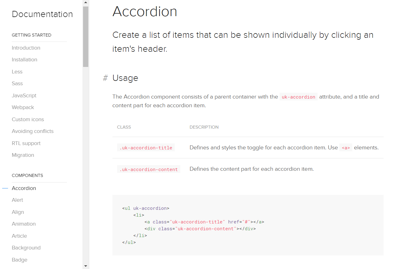
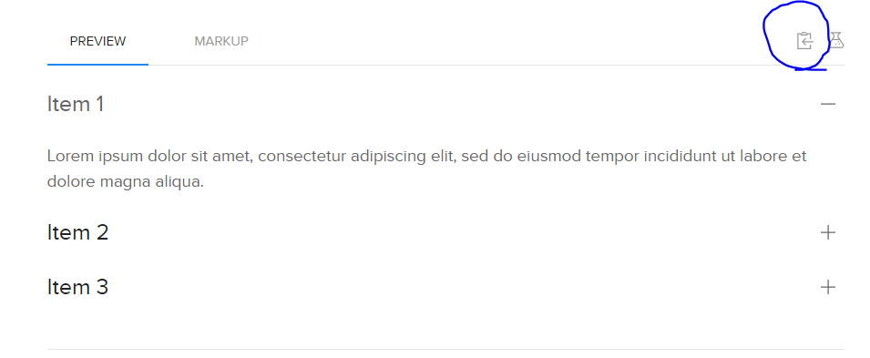
| UIKit #1 사용법, Accordion 컴포넌트 (0) | 2021.07.27 |