- 앵커 (anchor) : 한 페이지 안에서 지정된 위치로 점프하여 스크롤
a태그를 클릭하면 위치로 점프
<a href="#앵커이름"></a>
<태그이름 id="앵커이름"></>
smooth scrolling
1. html { scroll-behavior: smooth; }
2. jquery scrollTo 플러그인 이용

    <div class="container">
        <header>
            <!-- <a href="#none"><img src="img/naverband/logo-band.png" alt=""></a> -->
            <a href="#part1">html part</a>
            <a href="#part2">css part</a>
            <a href="#part3">jquery part</a>
            <a href="#part4">portfolio part</a>
        </header>
        <h1 id="part1">html part</h1>
        <hr>
        <p>
            lorem200
        </p>
        <a href="#" class="btn-gototop">Go to top</a>

        <h1 id="part2">css part</h1>
        <hr>
        <p>
            lorem200
        </p>
        <a href="#" class="btn-gototop">Go to top</a>
        <h1 id="part3">jquery part</h1>
        <hr>
        <p>
            lorem200
        </p>
        <a href="#" class="btn-gototop">Go to top</a>
        <h1 id="part4">portfolio part</h1>
        <hr>
        <p>
            lorem200
        </p>
        <a href="#" class="btn-gototop">Go to top</a>
html {
/* IE는 안됨 */
scroll-behavior: smooth;
}
body {
/* font-family: 'Raleway', 'sans-serif'; */
/* font-family: 'Noto Sans KR', 'sans-serif'; */
font-family: 'Montserrat', sans-serif;
margin: 0;
line-height: 1.5em;
background-color: #eee;
color: #222;
}
a {
text-decoration: none;
color: #000;
}
ul {
list-style: none;
}
.container {
margin: 20px;
}
header {
}
header a {
padding: 10px 20px;
background-color: teal;
color: #fff;
text-transform: uppercase;
}
.container p {
font-size: 1.5em;
line-height: 2em;
}
.btn-gototop {
padding: 10px 20px;
background-color: pink;
color: #fff;
border-radius: 20px;
}
- jquery scrollTo 플러그인 이용
<head>
    <title>Document</title>
    <script src="script/jquery-3.4.1.min.js"></script>
    <script src="script/jquery.scrollTo.min.js"></script>
</head>
<body>


    <!-- Smooth Scroll -->
    <script>
        $('header a, .btn-gototop').click(function() {
            // 0.9s
            $.scrollTo(this.hash || 0, 900);
            e.prventDefault();
        });
    </script>
    <!-- Smooth Scroll -->
</body>
'Web > HTML CSS 퍼블리싱' 카테고리의 다른 글
| Hamburger Menu (+, ~ 선택자 이용) (0) | 2021.07.22 |
|---|---|
| iframe, a target속성 (0) | 2021.07.22 |
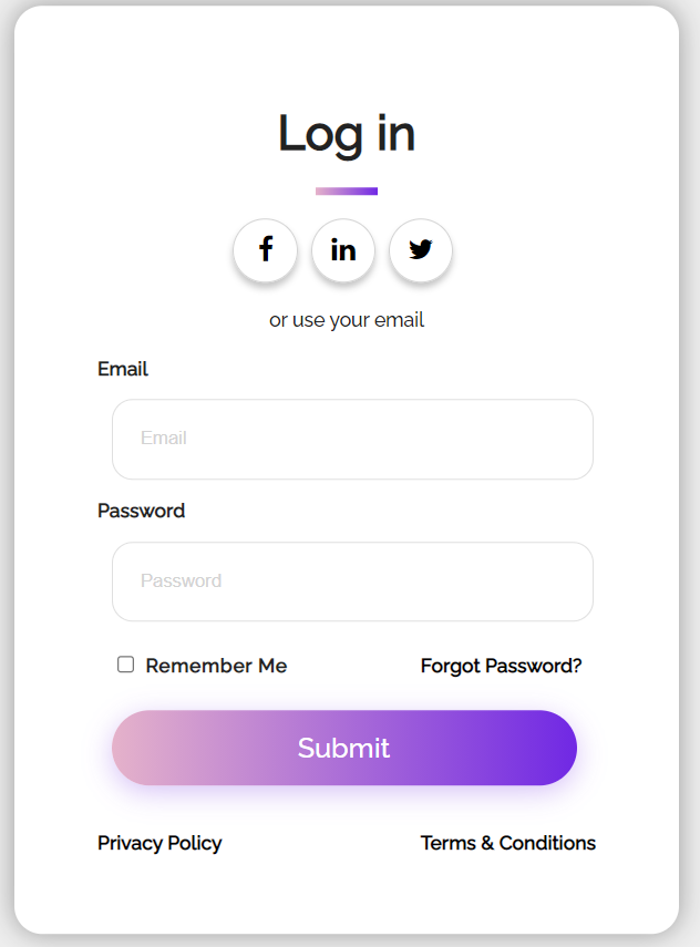
| login form #2 (0) | 2021.07.21 |
| 크롬 확장 프로그램 추천 (0) | 2021.07.20 |
| login form #1 (0) | 2021.07.08 |