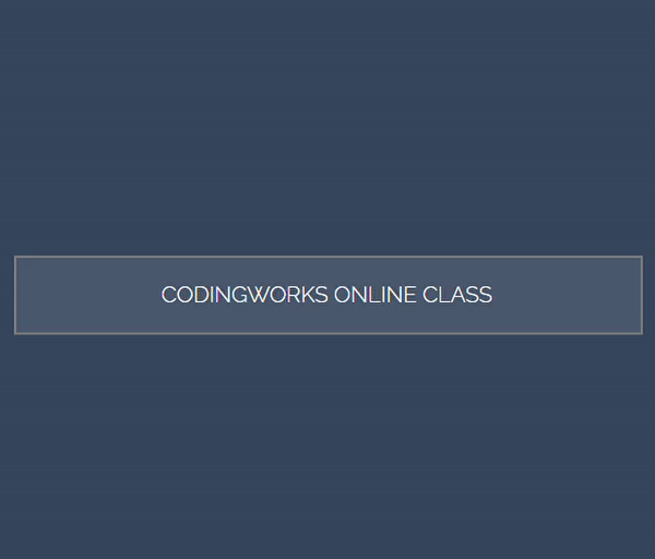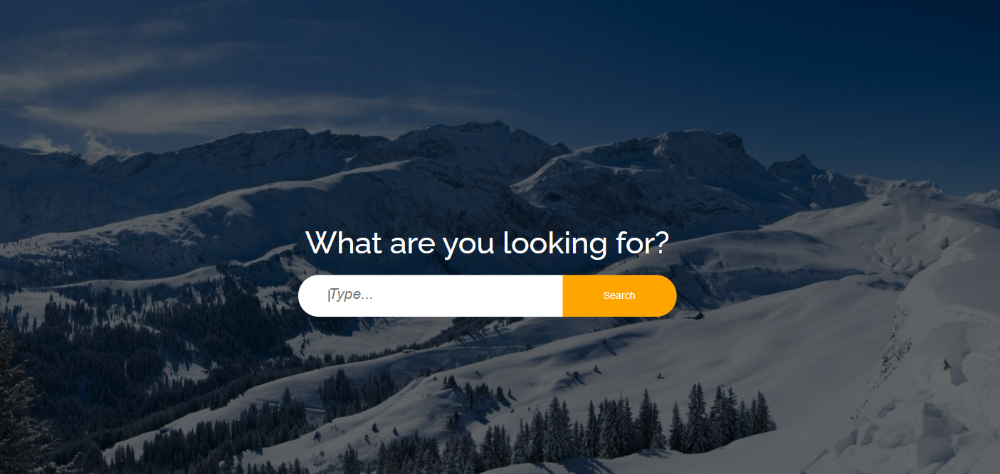
body 에 백그라운드 이미지 넣고 body:before에 백그라운드 색상을 어두운 색으로 오버레이
z-index: -1 로 설정해서 input요소 뒤로 감
|
1
2
3
4
5
|
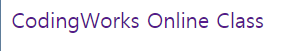
<form action="" class="search">
<h1>What are you looking for?</h1>
<input type="text" placeholder="Type...">
<input type="submit" value="Search">
</form>
|
cs |
|
1
2
3
4
5
6
7
8
9
10
11
12
13
14
15
16
17
18
19
20
21
22
23
24
25
26
27
28
29
30
31
32
33
34
35
36
37
38
39
40
41
42
43
44
45
46
47
48
49
50
51
52
53
54
55
56
57
58
59
60
61
62
63
64
65
66
67
68
69
70
71
72
|
body {
margin: 0;
line-height: 1.5em;
font-weight: 300;
background: url(../img/snow-photo.jpg) no-repeat center center;
/* 브라우저에 가득차게 */
background-attachment: fixed;
/* background-image: url();
background-repeat: no-repeat;
background-position: center center;
background-attachment: fixed; 와
background: url() no-repeat center center fixed 는 같다 */ }
/* 오버레이 */
body:before {
content: '';
position: absolute;
width: 100%;
height: 100%;
top: 0;
left: 0;
background-color: rgba(0, 0, 0, 0.596);
z-index: -1;
}
.search {
/* border: 1px solid #fff; */
position: absolute;
top: 50%;
left: 50%;
transform: translate(-50%, -50%);
}
.search h1 {
color: #fff;
text-align: center;
font-weight: normal;
margin-bottom: 30px;
font-size: 40px;
}
.search input[type=text],
.search input[type=submit] {
padding: 20px;
box-sizing: border-box;
border: none;
outline: none;
}
.search input[type=text] {
width: 350px;
padding-left: 40px;
border-radius: 40px 0 0 40px;
outline: none;
margin-right: -6px;
}
.search input[type=submit] {
width: 150px;
background-color: orange;
color: #fff;
border-radius: 0 40px 40px 0;
cursor: pointer;
}
.search input[type=submit]:hover {
background-color: darkgoldenrod;
}
.search input[type=text]::placeholder {
font-style: italic;
font-size: 20px;
}
|
cs |
'Web > HTML CSS 퍼블리싱' 카테고리의 다른 글
| 크롬 확장 프로그램 추천 (0) | 2021.07.20 |
|---|---|
| login form #1 (0) | 2021.07.08 |
| 프로필 카드 ui #1 hover effec (0) | 2021.07.06 |
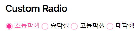
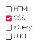
| custom checkbox #2 커스텀 라디오 버튼, 체크박스 (폰트어썸 아이콘) (0) | 2021.07.04 |
| custom checkbox #1 배경이미지 사용 (0) | 2021.07.01 |