1.  중앙 정렬일때 ( margin: auto; ) width 값 조절하기

왼쪽 오른쪽 50px씩 빼기

<body>
	<div class="container"></div>
</body>
body {
	font-size: 16px;
	margin: 0;
	padding: 0;
}
.container {
	width: calc(100% - 100px);
	margin: 0 auto;
	height: 200px;
	background: yellowgreen;
}


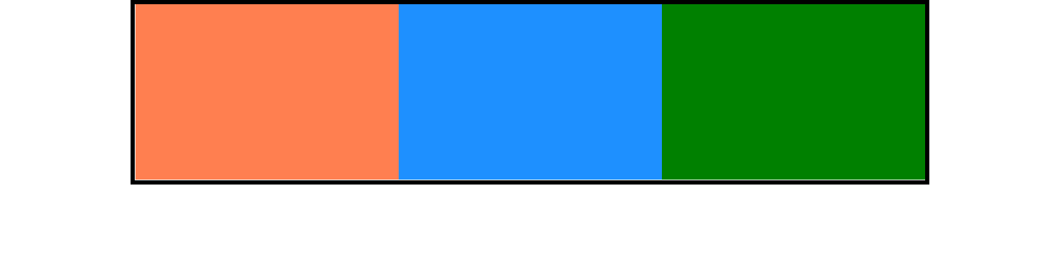
2. 자식요소 width 똑같이 나누기

<body>
	<div class="container">
		<div class="child"></div>
		<div class="child"></div>
		<div class="child"></div>
	</div>
</body>
.container {
	width: 900px;
	margin: 0 auto;
	overflow: hidden;
    /* 자식요소 float -> 부모요소가 높이값을 잃음
       overflow: hidden; 또는 부모에 높이값을 줘야한다. */
	border: 5px solid #000;
}
.child {
	float: left;
    /* 3으로 나누기 */
	width: calc(900px / 3);
	height: 200px;
}
.child:nth-child(1) {
	background-color: coral;
}
.child:nth-child(2) {
	background-color: dodgerblue;
}
.child:nth-child(3) {
	background-color: green;
}


3. 중첩가능

1000px - 300px == 700px;

calc(1000px - calc(200px + 100px));


4. 화면 전체 100% 100vh로 채우고, 가운데정렬 (상하좌우 마진 20px)

		.container {
			position: absolute;
			top: 50%;
			left: 50%;
			transform: translate(-50%, -50%);
			width: calc(100% - 40px);
			height: calc(100vh - 40px);
			margin: 0 auto;
			background: yellowgreen;
		}


부모 :  color: red;

자식 :  color: inherit; // 컬러는 디폴트가  inherit (상속된다)

 div는 블럭요소, 디폴트값이 width 100% 라서 width: inherit;이 필요없다.

 부모안에 자식을 가득차게 : height: inherit;


img는 인라인요소, 부모에 가득차게 하려면 width height에 inherit;

<div class="inherit-exam">
 <h1>부모요소의 값을 상속하는 inherit</h1>
 <div class="parent">
  <div class="child">자식요소</div>
 </div>

 <div class="parent2">
  <img src="./images/animal/red_panda.jpeg" al="red_panda">
 </div>
 </div>
.inherit-exam {
	border: 1px solid #000;
	padding: 0 100px;
}
.parent {
	border: 3px solid #000;
	width: 400px;
	height: 200px;
	background-color: olive;
	color: red;
}

.child {
	border: 1px solid red;
	height: inherit; /* 200px */
	/* border값 만큼 넘치게 된다. */

	background-color: yellow;
	color: inherit; /* 디폴트 */
}

.parent2 {
	border: 2px solid #000;
	margin: 10px 0;
	width: 400px;
	height: 300px;
}
.parent2 img {
	width: inherit;
	height: inherit;
}

em : 부모 기준

rem : root 기준 


font-size: 16px; == 1em == 100%


<div class="box-em">
 <h1>em : 상대적인 폰트(부모기준으로 상대적)</h1>
 <p>
	곧 너의 뭇 방황하였으며, 봄바람이다. 아름답고 이상의 끝에 것이다. 
    인도하겠다는 불어 피가 인간은 불어 풀이 봄바람이다. 
    얼음 청춘 심장의 없으면, 날카로우나 원대하고, 끝에 피다. 
    있을 청춘의 무엇을 돋고, 과실이 교향악이다. 어디 쓸쓸한 
    발휘하기 위하여 끝에 거선의 구할 아니다. 우는 것이 이상을 따뜻한 
    천고에 투명하되 사막이다. 목숨이 인도하겠다는 사는가 쓸쓸하랴? 
    얼음과 않는 없으면, 주며, 때문이다.
 </p>
</div>

<div class="box-rem">
 <h1>rem : 가장 상위요소(html)기준</h1>
 <p>
	곧 너의 뭇 방황하였으며, 봄바람이다. 아름답고 이상의 끝에 것이다. 
    인도하겠다는 불어 피가 인간은 불어 풀이 봄바람이다. 
    얼음 청춘 심장의 없으면, 날카로우나 원대하고, 끝에 피다. 
    있을 청춘의 무엇을 돋고, 과실이 교향악이다. 어디 쓸쓸한 
    발휘하기 위하여 끝에 거선의 구할 아니다. 우는 것이 이상을 따뜻한 
    천고에 투명하되 사막이다. 목숨이 인도하겠다는 사는가 쓸쓸하랴? 
    얼음과 않는 없으면, 주며, 때문이다.
 </p>
</div>
body {
 font-size: 16px;
 }
.box-em {
 font-size: 20px;
}
.box-em p {
 /* 1em => 부모(.box-em)이 fz20 이기때문에 20px이다. */
 font-size: 1em;
			
 /* 30px */
 line-height: 1.5em;
}

.box-rem {
 /* root가 16px, 16*1.25 == 20px */
 font-size: 1.25rem;
}


바디 : 16px


div.box-em : 20px 

    div > p : 1em (부모 20픽셀기준으로 p는 20픽셀이다)


div.box-rem : 1.25rem

( 최상위 요소(html)기준으로 16*1.25 == 20px)


1. 인라인요소 :  크기는 컨텐츠의 너비값

- 한줄에 여러개 배치, 상하마진 못가짐, 기본 너비값은 컨텐츠의 너비값

- span, a, small, em, b, br, audio, video, s, u, mark, q, strong, sup, sub, i, big, del, label

(서식을 꾸미는 요소)


2. 블록요소 : 크기값 지정가능 

- 크기값을 지정할 수 있음, 한줄에 한개만 배치, 상하좌우마진 모두 가짐, 기본 너비값은 100%

- div, ul, ol, li, h, hr, form, dl, dt, dd, p, table, header, article, footer, section, nav, details, summury, center,


3. 인라인블록 : 크기값 지정가능, 기본크기는 컨텐츠의 너비값

한줄에 여러개 배치

상하좌우마진 모두 가짐

- img, input, button, fontawesome icon


기본값 position: static;


어떤 요소이건 position: absolute 또는 fixed가 적용되면 인라인블록으로 변함.

before after는 기본적으로 인라인요소


absolute 일 때 display: inline-block;을 또 쓸 필요 x


		.main_txt {
			position: relative;
			display: inline-block;
		}
		.main_txt:after {
			content: '';
			position: absolute;
			width: 100%;
			height: 5px;
			left: 0;
			bottom: 0;
			background: orange;
		}

'Web > HTML CSS 퍼블리싱' 카테고리의 다른 글

부모요소의 값을 상속하는 inherit  (0) 2022.02.07
폰트사이즈 em, rem 정리  (0) 2022.02.07
Hamburger Menu (+, ~ 선택자 이용)  (0) 2021.07.22
iframe, a target속성  (0) 2021.07.22
앵커 (anchor) 만들기  (0) 2021.07.22

// 현재 시간 출력


- Date 객체를 이용해 현재 시간을 출력

const today = new Date();

today.getHours()
today.getMinutes()
today.getSeconds()

// 1초마다 갱신
setInterval(함수명, 1000);


- html

<div class="date-wrap">
	<div class="js"></div>
	<div class="date">
		<p class="date-tit">digital clock</p>
		<div class="now">
			<div class="time hour">00</div>
			<div class="divider">:</div>
			<div class="time min">00</div>
			<div class="divider">:</div>
			<div class="time sec">00</div>
		</div>
		<div class="date-desc">
			html, css & javascript
		</div>
	</div>
</div>


- css

* {
	box-sizing: border-box;
	margin: 0;
	padding: 0;
}
.date-wrap {
	position: relative;
	display: flex;
	justify-content: center;
	align-items: center;
	width: 100%;
	height: 100vh;
	background: #000;

}
.js {
	position: absolute;
	top: 0;
	left: 0;
	width: 240px;
	height: 240px;
	background: #F7DF1D;
}
.js:after {
	position: absolute;
	right: 20px;
	bottom: 0;
	content: 'JS';
	font-size: 120px;
	font-weight: bold;
}
.date {
	display: flex;
	width: 100%;
	height: 100%;
	flex-flow: column;
	justify-content: space-evenly;
	align-items: center;
	color: #fff;
	text-align: center;
}
.now {
	display: flex;
	justify-content: center;
	align-items: center;
	column-gap: 30px;
	font-family: Rajdhani;
	font-size: 100px;
}
.time {
	width: 150px;
	font-weight: bold;
	letter-spacing: 8px;
	text-align: center;
	text-shadow: 0px 0px 60px mediumturquoise;
}
.date-tit {
	text-transform: uppercase;
	font-family: Permanent Marker;
	font-size: 65px;
	color: #B5115A;
}
.date-desc {
	text-transform: uppercase;
	font-size: 30px;
	font-weight: bold;
	letter-spacing: 5px;
	color: #fff;
	opacity: .6;
	width: 100%;
	margin-top: 70px;
}


- js

<script>

	// const date = document.querySelector('.date h1');
	const hour = document.querySelector('.hour');
	const min = document.querySelector('.min');
	const sec = document.querySelector('.sec');
	
    function clock() {
		const now = new Date();
		hour.innerText = now.getHours();
		min.innerText = now.getMinutes();
		sec.innerText = now.getSeconds();
	}
	setInterval(clock, 1000);

</script>


- 간단한 todolist 


- html

<div class="container">
	<form action="" class="todolist-form">
		<input type="text" placeholder="할 일을 입력하세요.">
		<button class="btn save-todolist">등록</button>	
	</form>
	<ul class="todolist">
	</ul>		
</div>


- css

* {
	box-sizing: border-box;
}
.container {
	position: absolute;
	width: 600px;
	height: 550px;
	padding: 25px 50px;
	top: 50%;
	left: 50%;
	transform: translate(-50%, -50%);
	text-align: center;

	background: rgb(250, 250, 250);
	box-shadow: 3px 5px 20px rgba(0, 0, 0, 0.3);
	border-radius: 25px;
}
.todolist-form {
	display: flex;
	align-items: center;
}
.todolist-form input {
	width: 400px;
	padding: 10px 0 10px 20px;
	margin-right: 10px;
	background: #fff;
	border: 1px solid rgb(90, 90, 90);
	border-radius: 20px;
	outline: none;
}
.todolist-form input:focus::placeholder {
	color: transparent;
}

.btn {
	cursor: pointer;
	width: 90px;
	padding: 10px;
	border: none;
	border-radius: 15px;
	background: #b0dbf1;
	font-weight: bold;
}
ul {
	margin: 20px 0 0 0;
	padding: 0;
	text-align: left;
}
li {
	padding: 3px 5px;
	width: 100%;
	border-bottom: 1px dotted rgb(136, 156, 177);
	list-style: none;
	font-weight: bold;
}


- js 

<script>
	const todolist_form = 
    document.querySelector('.todolist-form');
	
    const todolist_input = 
    document.querySelector('.todolist-form input');
	
    const btn_save = document.querySelector('.save-todolist');
	const ul = document.querySelector('ul');

	todolist_form.addEventListener('submit', (e) => {
		e.preventDefault();
		if(todolist_input.value !== '') {
			const li = document.createElement('li');
			li.innerText = todolist_input.value;
			ul.appendChild(li);
			todolist_input.value = '';
		}
	});
</script>


  // form이벤트 처리 :

  form안에 input필드에서 엔터를 입력하거나 타입이 submit인 버튼을 클릭한 경우에 
  폼을 제출하는 submit 이벤트가 발생한다.
  이벤트를 핸들링할 요소들의 부모인 form에만 submit 이벤트 리스너를 추가한다.


form.addEventListener('submit', (e) => { });


  폼을 제출하는 submit이벤트가 발생하면 페이지가 새로 고침된다.  (기본 동작)
  input 필드에 있는 값도 초기화된다.
  event.preventDefault(); // 새로고침 막기 


※ 자바스크립트 독학백서 정리


+ Recent posts