- checkbox
<input type="checkbox">
체크박스를 이용할 때 텍스트를 눌러도 체크가 가능하게 만들어야한다.
input의 id == label의 for 일치시키는 방법

|
1
2
3
4
5
6
7
8
9
10
11
12
13
14
|
<div class="custom">
<label>
<input type="checkbox">
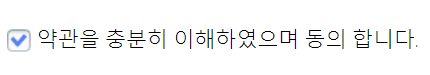
약관을 충분히 이해하였으며 동의 합니다.
</label>
</div>
<!-- 추천 방법 -->
<div class="custom">
<input type="checkbox" id="agree-chk">
<label for="agree-chk">
약관을 충분히 이해하였으며 동의 합니다.
</label>
</div>
|
cs |
- custom checkbox 만들기
체크박스 이미지를 하나 준비한다. label안에 이미지를 넣을 태그 하나 만들어야한다.
이 예제에서는 em태그로 했지만 다른 태그도 가능
처음에 빈 체크박스 이미지를 보여주고 checked 되면 체크된 이미지를 보여준다. (백그라운드 포지션 right center)
- html
|
1
2
3
4
5
|
<div class="custom">
<input type="checkbox" id="chk">
<label for="chk"><em></em>약관을 충분히 이해하였으며 동의 합니다.
</label>
</div>
|
cs |
- css
em은 인라인요소이다.
백그라운드-포지션: left (수평), center (수직) // 디폴트값
:checked 눌렀을 때
+ 인접선택자
|
1
2
3
4
5
6
7
8
9
10
11
12
13
14
15
16
17
18
19
20
21
22
23
|
.custom input[type=checkbox] {
/* html에서 기능을 하지않는 것이 아니라 보이지 않는것임 */
display: none;
}
.custom label em {
display: inline-block;
/* border: 1px solid red; */
width: 18px;
height: 18px;
/* 인라인 끼리 중앙을 맞출때 */
vertical-align: middle;
margin-right: 5px;
background: url(../img/check/checkbox-01.png) no-repeat;
/* background-position: left center; */
}
/* type=checkbox인 체크 박스를 눌렀을 때 그 바로밑에 있는 label em 요소
+ 인접선택자 : 바로 밑에 요소 */
.custom input[type=checkbox]:checked + label em {
background-position: right center;
}
|
cs |
'Web > HTML CSS 퍼블리싱' 카테고리의 다른 글
| 프로필 카드 ui #1 hover effec (0) | 2021.07.06 |
|---|---|
| custom checkbox #2 커스텀 라디오 버튼, 체크박스 (폰트어썸 아이콘) (0) | 2021.07.04 |
| before after 가상클래스 #3 호버이펙트 - rotate (0) | 2021.07.01 |
| before after 가상클래스 #2 호버이펙트 (0) | 2021.07.01 |
| before 가상클래스 #1 호버이펙트 (0) | 2021.06.30 |