Wow js는 애니메이션을 지연시켜 스크롤을 하면 시작하는 scroll reveal animation이다.


https://wowjs.uk/docs.html


wow.js — Documentation

Setup wow.js 1 Link to the CSS animation library Link to Animate.css (You can link to another CSS animation library by changing wow.js settings) 2 Link and activate wow.js new WOW().init(); Reveal CSS Animations 1 Make an element revealable Add the CSS cla

wowjs.uk


1. wowjs > GITHUB 들어가서 폴더 다운로드

2. wow.min.js 링크, 기본세팅

<head>
	<!-- Wow.js -->
	<script src="plugin/wowjs/wow.min.js"></script>
</head>
<body>
	<script>
		new WOW().init();
	</script>
</body>


3. 애니메이션 키프레임 만들고 키프레임이 적용될 클래스를 만든다.

딜레이시키고 싶은 요소에 클래스명 wow 넣기 


*option : data-wow-duration="2s" data-wow-delay="5s" 


left to right 

right to left 두개의 애니메이션 키프레임을 만들기

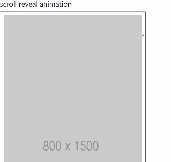
		<h1>scroll reveal animation</h1>
		<div class="parent">
			<img src="http://placehold.it/800x1500">
			<div class="ltor wow">left</div>
			<div class="rtol wow">right</div>
		</div>
/* css */
.parent {
	border: 1px solid #000;
	width: 800px;
	padding: 20px;
	margin-bottom: 30%;
	overflow: hidden;
}
.parent div {
	float: left;
	border: 3px solid #000;
	width: 50%;
	height: 200px;
	box-sizing: border-box;
	text-align: center;
	line-height: 200px;
	font-size: 3em;
}
.ltor {
	animation: ltor 1s linear;
	animation-fill-mode: both;
}
.rtol {
	animation: rtol 1s linear;
	animation-fill-mode: both;
}
@keyframes ltor {
	0% {
		opacity: 0;
		transform: translateX(-100px);
	}
	100% {
		opacity: 1;
		transform: translateX(0);
	}
}
@keyframes rtol {
	0% {
		opacity: 0;
		transform: translateX(150px);
	}
	100% {
		opacity: 1;
		transform: translateX(0);
	}
}


- placehold.it

아직 이미지가 없을 때 원하는 크기의 이미지를 넣을 수 있다.

800*1500 사이즈

<img src="http://placehold.it/800x1500">


- 설정

boxClass: '클래스명',       


// animation css 사용 o 

animateClass: 'animated' 


// default 0, 150px 정도 지나서 애니메이션이 나타난다.
offset:  150,           

// 디폴트 값 
wow = new WOW({
    boxClass:     'wow',      // default
    animateClass: 'animated', // default
    offset:       0,          // default
    mobile:       true,       // default
    live:         true        // default
    })
    wow.init();
    
// js    
wow = new WOW({
    boxClass:     'wow', 
    offset:       150,         
    mobile:       true,       
    live:         true       
    })
    wow.init();


웹 표준? 

W3C 표준안에 따라 웹사이트를 작성할 때 이용하는 html, css, js를 만드는 것이다.

예) 시멘틱 태그 사용, W3C에서 권장하지 않는 태그 사용하지 않기

위와 같은 것을 지키면 웹 표준을 준수하는 html 코딩이라고 할 수 있다..


- 시멘틱 태그

<main>
    <header>
        <nav></nav>
    <section>
        <article></article>
        <aside></aside>
    </section>    
    <footer></footer>
</main>


웹 접근성?

모든 사용자가 신체적, 환경적 조건에 관계없이 웹에 접근하여 이용할 수 있도록 보장하는 것이다.

시각장애인이 화면 낭독 프로그램을 이용해 컴퓨터를 사용할 때, 웹 접근성을 가진 웹페이지라면 일반인과 동등한 수준으로 웹서핑을 즐길 수 있다.


예) img 태그 : alt속성을 작성해야 스크린리더가 읽는다.

img안에서 width height를 조절하는 것은 웹 표준이 아니다.

<!-- img안에서 width, height 조절하는것은 웹표준이 아니다. -->
<img src="images/ocean.jpg" alt="바다 풍경">


강조 태그, 취소선 태그 :

<b><strong>는 똑같이 강조 태그이지만 <strong> 태그는 스크린리더가 강조해서 읽는다.

<s><del> 태그에서는 <del>만 스크린리더가 읽지 않는다.

// 강조 태그
<b>
<strong> - 강조해서 읽는다.

// 취소선태그
<s>
<del> - 읽지않는다.


크로스 브라우징?

웹 표준기술을 채용하여 다른 기종 혹은 플랫폼에 따라 달리 구현되는 기술을 비슷하게 만듦과 동시에 어느 한쪽에 최적화되어 치우지지 않도록 공통 요소를 사용하여 웹페이지를 제작하는 기법이다.


내가 만든 웹페이지가 다양한 브라우저에서 문제없이 잘 보이게 하는 것이다.

예) 인터넷 익스플로러에서 작동하지 않는 filter, display: grid속성


IE에서도 잘 동작하려면 위와 같은 속성은 지양해야 한다. 하지만 IE를 제외하고 제작하는 방법도 있다.

		img {
			width: 600px;	
			filter: grayscale(1);
			transition: 1s;
		}
		img:hover {
			filter: grayscale(0);
		}
		.container {
			display: grid;
		}


    <div class="loading">
        <span></span>
        <span></span>
    </div>

부모가 이미 absolute면 relative로 바꾸지 않아도 된다.

calc() 함수 사용해서 정확하게 계산하기


.loading {
    position: absolute;
    top: 50%;
    left: 50%;
    transform: translate(-50%, -50%);    
    width: 100px;
    height: 100px;
    /* border: 1px solid #000; */
}
.loading span {
    position: absolute;
    width: 30px;
    height: 30px;
    top: 0;
    left: 0;
    animation: clockwise 2s linear infinite;
}
.loading span:nth-child(1) {
    background-color: pink;

}
.loading span:nth-child(2) {
    background-color: palegoldenrod;
    animation-delay: 1s;
}

/* Animation */
@keyframes clockwise {
    0% {
        top: 0;
        left: 0;
    }
    25% {
        top: 0;
        left: calc(100% - 30px);
        background-color: dodgerblue;
    }
    50% {  
        top: calc(100% - 30px);
        left: calc(100% - 30px);
        background-color: orange;
    }
    75% {
        top: calc(100% - 30px);
        left: 0;
        background-color: yellowgreen;
    }
    100% {
        top: 0;
        left: 0;
    }
}


    <div class="loading">
        <span></span>
        <span></span>
        <span></span>
    </div>

일단 중앙정렬, nth-child로 색 다르게 넣기

@keyframes 로 0%, 100%는 안보이고 크기작게 50%는 보이고 크기1.2배가 되게 한다.


animation: 이름, duration, linear(키프레임 구간이 넘어갈때 부드럽게), infinite;animation-delay: 첫번째 span이 애니메이션 되고나서 0.2s뒤에 2번째 span이 0.3s뒤에 3번째 span이 애니메이션 된다.

.loading {
    position: absolute;
    top: 50%;
    left: 50%;
    transform: translate(-50%, -50%);    
}
.loading span {
    display: inline-block;
    width: 30px;
    height: 30px;
    border-radius: 50%;
    animation: loading 1s linear infinite;
}
.loading span:nth-child(1) {
    background-color: #F2A2A9;
    animation-delay: 0;
}
.loading span:nth-child(2) {
    background-color: #55A6D9;
    animation-delay: .2s;
}
.loading span:nth-child(3) {
    background-color: #5FC2D9;
    animation-delay: .4s;
}
/* Animation */
@keyframes loading {
    0% {
        opacity: 0;
        transform: scale(0.5);
    }
    50% {
        opacity: 1;
        transform: scale(1.2);    
    }
    100% {
        opacity: 0;
        transform: scale(0.5);
    }
}

- UIKit : css framework


framework : 프로그램을 개발하기 위한 여러 요소들과 메뉴얼인 룰을 제공하는 프로그램, 처음부터 만들어야하는게 적다.


https://getuikit.com/


UIkit

UIkit, a lightweight and modular front-end framework for developing fast and powerful web interfaces.

getuikit.com


getting started 클릭


다운로드, cdn 둘다 가능하다. cdn코드를 복사해서 html에 link하기  

마지막줄은 icons라서 필수는 아님!!


<!DOCTYPE html>
<html lang="en">
<head>
    <meta charset="UTF-8">
    <meta http-equiv="X-UA-Compatible" content="IE=edge">
    <meta name="viewport" content="width=device-width, initial-scale=1.0">
    <title>Document</title>

    <!-- UIkit CDN -->
    <link 
    	rel="stylesheet" 
    	href="https://cdn.jsdelivr.net/npm/uikit@3.7.1/dist/css/uikit.min.css" />
    <script 
    	src="https://cdn.jsdelivr.net/npm/uikit@3.7.1/dist/js/uikit.min.js"></script>
 <!-- 
    <script src="https://cdn.jsdelivr.net/npm/uikit@3.7.1/dist/js/uikit-icons.min.js"></script> 
 -->
</head>


연결을 하고 어떤 컴포넌트가 있는지 옆 사이드바에서 확인가능하다. 어코디언 클릭

어떻게 사용하는지 나와있다.


맨위에있는 가장 기본적인 형태를 복사하기

markup을 클릭하고 직접 복사해도 됨 (복사 후 인덴트 확인하기)


ul 안에 uk-accordion은 속성이자 값이다. 클래스명처럼 css에서 사용하면된다.


.uk-accordion { } 

    <ul uk-accordion>

    </ul>


컴포넌트 옵션이 다양하게 있는데 기본값은 0.2초 멀티플 false이다.

한번에 한가지 섹션만 나오게 되어있음 


// 인라인 스타일 넣는 방식과 같다. 
// 0.5초, 멀티플true
<ul uk-accordion="duration: 500; multiple: true;">
</ul>

// css
        .uk-accordion {
            position: absolute;
            top: 50%;
            left: 50%;
            transform: translate(-50%, -50%);
            width: 600px;
            padding: 20px;
            border-radius: 20px;
            box-shadow: 0 0 20px rgba(0, 0, 0, 0.178);
        }


- 인라인 요소


    크기값 x 
    한줄에 여러개 배치
    상하마진 못가짐
    기본 너비값은 컨텐츠의 너비값

<head>
    <style>
        span {
            border: 1px solid #000;
            width: 100px;
            height: 100px;
            margin: 20px;
        }
    </style>
</head>
<body>
	<div>1. inline</div>    
    <span>Inline</span>
    <span>Inline2 </span>
</body>

크기값x 좌우마진만 갖는다.


- 블럭 요소


    크기값 o

    한줄에 한개만 배치

    상하좌우 마진 가짐

    기본 너비값 100%


div {

    width: 100%;

이렇게 기본 너비값을 써줄 필요가 없음!

}

<head>
    <style>
       .block {
            border: 1px solid red;
            width: 100px;
            height: 100px;
            margin: 20px;
        }
    </style>
</head>
<body>
    <div>2. block</div>
    <div class="block">Block</div>
    <div class="block">Block2</div>
</body>


- 인라인 블럭

크기값 o

한줄에 여러개 배치

상하좌우 마진 가짐

기본 너비값은 컨텐츠의 너비값 

img, input, button, fontawesome icon 


h1은 block요소이지만 display: inline-block으로 바꿔서 img옆에 붙게 된다.

<head>
    <style>
        img {
            margin: 20px;
            width: 300px;
            height: 300px;
        }
        h1 {
            border: 1px solid blue;
            display: inline-block;
        }
    </style>
</head>
<body>
    <img src="img/face-02.jpg" alt="">
    <img src="img/face-02.jpg" alt="">
    <h1>block elements</h1>
</body>


- 포지션 

position: static; // 기본값

어떤 요소이건 positionabsolute; fixed; 가 들어가면 모든 요소는 인라인 블럭으로 바뀐다.

position: absolute;

/* display: inline-block; 의미가 없음, absolute면 인라인블럭이 된다. */ 

+ Recent posts