- slick js 다운로드 받기 (CDN 가능 -> 공식사이트에 있다)

https://kenwheeler.github.io/slick/


slick - the last carousel you'll ever need

slick is a responsive carousel jQuery plugin that supports multiple breakpoints, CSS3 transitions, touch events/swiping & much more!

kenwheeler.github.io


menu > get it now 클릭 


다운로드 후  

우리가 필요한 파일은 맨위 slick폴더이다. (나머지는 지우기)


- slick 폴더에서 필요한 파일만 나두고 지우기 

(필수) slick.css(또는 min.css) /slick.js/slick-theme.css/ 

(선택) ajax-loader.gif, fonts폴더


내 워크스페이스에 slick폴더 추가 (link로 연결하기 위해서)

<!-- <head></head> 안에 연결 -->
	<!-- Slick.js -->
	<link rel="stylesheet" href="plugin/slick/slick-theme.css">
	<link rel="stylesheet" href="plugin/slick/slick.css">
	<script src="plugin/slick/slick.js"></script>


- 기본 사용법

(slick-thmem.css를 연결하지 않으면 dots:true 일 때 모양이 안예쁘게 나옴)

	<div class="slider">
		<div>content 1</div>
		<div>content 2</div>
		<div>content 3</div>
		<div>content 4</div>
		<div>content 5</div>
		<div>content 6</div>
		<div>content 7</div>
		<div>content 8</div>
		<div>content 9</div>
	</div>

	<script>
		$('.slider').slick();
	</script>
		.slider {
			width: 800px;
			margin: auto;
		}
		.slider div {
			border: 1px solid #000;
			height: 300px;
			line-height: 300px;
			text-align: center;
			background: #ddd;
		}


- (옵션)

$('.slider').slick({
	// 디폴트
	// infinite: true, 
	
	slidesToShow: 3, // 몇개씩 보여줄건지	
	slidesToScroll: 3, // 몇개씩 넘길건지

	//자동재생 2s
	autoplay: true,
	autoplaySpeed: 2000,

	// fade
	// speed: 500,
	// fade: true,
	// cssEase: 'linear'

	dots: true, // dots 아이콘

	// 반응형
	responsive: [
	{
		breakpoint: 1024,
		settings: {
			slidesToShow: 3,
			slidesToScroll: 3,
			infinite: true,
			dots: true
		}
	},
	{
		breakpoint: 600,
		settings: {
			slidesToShow: 2,
			slidesToScroll: 2
		}
	},
	{
		breakpoint: 480,
		settings: {
			slidesToShow: 1,
			slidesToScroll: 1
		}
	}
	]
});
		@media (max-width: 768px) {
			.slider {
				width: 100%;
			}
			.slider .slick-arrow {
				display: none !important;
				/* 슬릭슬라이더가 우선순위를 가지고 있기 때문에 변경이 안되면 !important 필요 */
			}
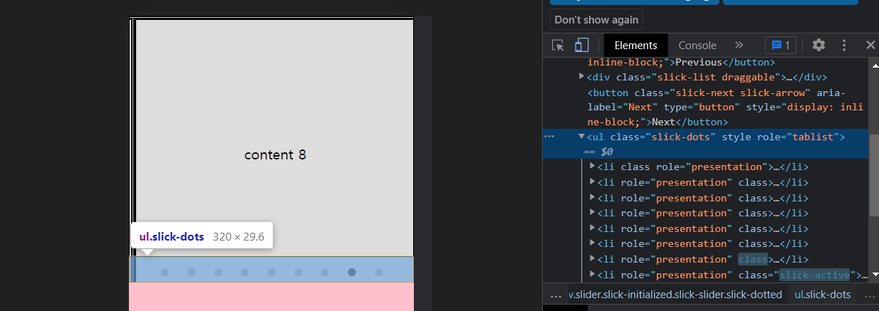
			.slider .slick-dots {
				border: 1px solid #000;
				bottom: 0;
			}


css수정할 때 개발자도구에서 클래스명을 보고 바꾸면 된다.


스크롤하면 헤더, btn-top버튼에 active클래스를 추가하여 변경하기

<head>안에 폰트어썸, 제이쿼리 연결 !!!

	<div class="container">
		<header>
			<div class="lnb-inner">lnb-inner</div>
			<div class="gnb-inner">gnb-inner</div>
		</header>
		<section class="main">
			<p>lorem100</p>
		</section>
		<a href="#" class="btn-top">
			<i class="fas fa-arrow-up"></i>
		</a>
	</div>
		* {
			box-sizing: border-box;
		}
		body {
			margin: 0;
			padding: 0;
		}
		header {
			position: fixed;
			width: 100%;
			top: 0;
			left: 0;
			color: #fff;
			text-align: center;
		}
		.lnb-inner, 
		.gnb-inner {
			transition: .5s;
		}
		.lnb-inner {
			background-color: crimson;
			height: 40px;
			line-height: 40px;
			overflow: hidden;
		}
		.gnb-inner {
			background-color: #000;
			height: 80px;
			line-height: 80px;
		}

		/* Active Class */
		header.act .lnb-inner {
			height: 0;
		}
		header.act .gnb-inner {
			background-color: #fff;
			color: #000;
			box-shadow: 0 5px 10px rgba(0, 0, 0, 0.2);
		}

		section.main {
			font-size: 3em;
			line-height: 2em;
			color: #bbb;
		}
		.btn-top {
			opacity: 0;
			bottom: 0px;
			/* opacity: 0;
			transform: translateY(80px); */
			transition: .5s;
			
			position: fixed;
			/* bottom: 20px; */
			right: 20px;
			width: 40px;
			height: 40px;
			line-height: 44px;
			text-align: center;
			background-color: #000;
			border-radius: 50%;
		}
		.btn-top i {
			font-size: 25px;
			color: #fff;
		}
		.btn-top.act {
			opacity: 1;
			bottom: 20px;
			/* transform: translateY(0); */
		}


// btn-top 버튼이 아래에서 위로 올라오는효과 

1. translateY()

2. bottom: 

		.btn-top {
			opacity: 0;
			bottom: 0px;
			transition: .5s;

			/* 또는 */

			opacity: 0;
			transform: translateY(80px);
			transition: .5s;
		}

		.btn-top.act {
			opacity: 1;
			bottom: 20px;

			/* 또는 */

			opacity: 1;
			transform: translateY(0);
		}


// 제이쿼리

window가 scroll될 때 스크롤탑이 50보다 크면 (스크롤한 상태) >> active클래스추가

else >> remove .active


$(window).scrollTop() : 스크롤에 따라 변하는 세로좌표, 맨위(0) ~ 맨아래(max)


	<script>
		$(window).scroll(function() {
			if($(window).scrollTop() > 50) {
				$('header, .btn-top').addClass('act');
			} else {
				$('header, .btn-top').removeClass('act');
			}
		});
	</script>

필터 속성은 IE에서는 적용되지 않는다.


blur(px) grayscale(%)
흐림효과
값이 클수록 흐림이 커진다.
회색조
grayscale(0) // 디폴트
grayscale(1 | 100%)


hover시 원본 이미지로 되돌아 옴 

<style>
		body {
			padding: 50px;
		}
		img {
			width: 500px;	
			transition: 1s;
		}
		.blur {
			filter: blur(5px);
		}
		.blur:hover {
			filter: blur(0);
		}

		.grayscale {
			filter: grayscale(1);
		}
		.grayscale:hover {
			filter: grayscale(0);
		}
	</style>
</head>
<body>
	<!-- 필터 속성은 iE에서는 적용이 되지 않는다. -->
	<img class="blur" 
      src="images/sky/video-sky-02_Moment.jpg" 
      alt="구름 풍경">
	<img class="grayscale" 
      src="images/sky/video-sky-02_Moment.jpg" 
      alt="구름 풍경">
</body>


https://developer.mozilla.org/ko/docs/Web/CSS/filter


filter - CSS: Cascading Style Sheets | MDN

CSS filter 속성은 흐림 효과나 색상 변형 등 그래픽 효과를 요소에 적용합니다.

developer.mozilla.org


- 제이쿼리 연결 

<head>
	<!-- Jquery -->
	<script src="js/jquery-3.4.1.min.js"></script>
 </head>


1. 모달창 만들기

.modal-open 클릭 -> 모달창 열리고 

.overlay .btn-close 클릭 -> 모달창 닫힘 


<button class="modal-open">뉴스레터 구독하기</button>
<div class="modal">
	<div class="modal-wrap">
		<div class="img"></div>
		<div class="modal-content">
			<div class="content-header">
				<h2>소식을 어디로 보내드릴까요?</h2>
				<button class="btn-close">&times;</button>
			</div>
			<div class="content-desc">
				<input type="email" placeholder="이메일 주소를 입력하세요.">
				<button>뉴스레터 구독하기</button>
				<p>
					바쁜 일상, 필요한 정보만을 찾을 시간이 없기에 늘 한두 달 소식이 늦는 월간잡지로 만족하지 않기에 매주 월요일 아침9시 당신께 소식을 전달합니다.
				</p>
			</div>	
		</div>
	</div>
</div>
<div class="overlay"></div>
	* {
		box-sizing: border-box;
	}
	body {
		padding: 0;
		margin: 0;
		font-size: 16px;
		line-height: 1.5em;
	}
	.modal-open {
		cursor: pointer;
	}
	.modal {
		opacity: 0;
		transition: .5s;

		position: fixed;
		top: 50%;
		left: 50%;
		transform: translate(-50%, -50%);
		z-index: 10;
	}
	.modal.act {
		opacity: 1;
	}
	.modal-wrap {
		display: flex;
		width: 600px;
		background-color: #fff;
		box-shadow: 0 0 10px rgba(0, 0, 0, 0.2);
		border-radius: 5px;
		overflow: hidden;
	}
	.modal-wrap > div {
		padding: 25px;
	}
	.modal-wrap .img {
		flex: 1;
		background: url(images/person/office.jpg) no-repeat right center;
		background-size: cover;
	}
	.modal-content {
		flex: 2;
		text-align: center;
	}
	.content-header {
	}
	.content-header h2 {
		margin: 20px 0px 10px;
		font-size: 23px;
		font-weight: bold;
	}
	.btn-close {
		cursor: pointer;

		position: absolute;
		top: 10px;
		right: 10px;
		font-size: 30px;
		border: none;
		background-color: transparent;
		color: #ccc;
	}
	.content-desc input[type=email] {
		display: block;
		width: 100%;
		border: 1px solid #ccc;
		outline: none;
		padding: 8px;
		margin-bottom: 6px;
		text-align: center;
	}
	.content-desc input[type=email]::placeholder {
		color: #bbb;
		transition: .5s;
	}
	.content-desc input[type=email]:focus::placeholder {
		color: transparent;
		opacity: 0;
	}
	.content-desc button {
		cursor: pointer;
		display: block;
		width: 100%;
		padding: 8px;
		background-color: crimson;
		color: #fff;
		border: none;
	}
	.overlay {
		opacity: 0;
		pointer-events: none;

		position: fixed;
		top: 0;
		left: 0;
		width: 100%;
		height: 100vh;
		background: rgba(0, 0, 0, 0.2);
	}
	.overlay.act {
		opacity: 1;
		pointer-events: all;
	}

** input button은 블럭요소로 변경해도 width:100%가 되지 않는다.

** .overlay { pointer-events: none;(존재하지만 마우스 클릭을 받지 않게) 또는 visibility: hidden; 이 필요하다.

오버레이가 화면 전체에 감싸져 있어서 opacity:0이라도 존재하기 때문에 클릭이벤트가 발생하지 않는다.


	<script>
		$('.modal, .overlay').addClass('act');
		$('.modal-open').click(function() {
			$('.modal, .overlay').addClass('act');
		});
		$('.btn-close, .overlay').click(function() {
			$('.modal, .overlay').removeClass('act');
		});
	</script>


2. 반응형 


		@media (max-width: 767px) {
			.modal-wrap {
				flex-direction: column;
				width: 100%;
			}
			/* 아이폰6기준 375px > 350px로 설정하면 약간의 여유가 생긴다. */
			.modal-wrap > div {
				width: 350px;
			}
			.modal-wrap .img {
				flex-basis: 250px;
			}
			.content-header h2 {
				margin: 0px 0px 20px;
				font-size: 22px;
			}
		}

처음에 .img에 flex:1로 높이를 잡아놔서 height가 안먹힌다.

flex:1 == flex-grow:1 flex-shrink:0 flex-basis:auto


flex 속성에서 값이 1개일 때: flex:1 (number를 지정하면 flex-grow);

flex: 10em | 30% (length | % 를 지정하면 flex-basis); 


3. translate 속성

.modal {
	opacity: 0;
	transition: .5s;

	position: fixed;
	top: 50%;
	left: 50%;

	/* 위 -> 아래 */
	transform: translate(-50%, -80%);

	/* 아래 -> 위 */
	transform: translate(-50%, -20%);
	/* 왼 -> 오른쪽, 오른쪽 -> 왼쪽 */
	transform: translate(-80%, -50%);
	transform: translate(-20%, -50%);

	z-index: 10;
}

.modal.act {
	opacity: 1;
	transform: translate(-50%, -50%);
}
		.modal {
			opacity: 0;
			transition: .5s;

			position: fixed;
			top: 50%;
			left: 50%;
			
            /* 작았다가 커지는 효과 */
			transform: translate(-50%, -50%) scale(.8);
			z-index: 10;
		}
		.modal.act {
			opacity: 1;
			transform: translate(-50%, -50%) scale(1);
		}

이미지맵(image map) : 한이미지를 여러 개의 구역으로 나누어 링크를 거는 것


- 사각형 이미지맵

1. 기본 구조

<img src="이미지경로" alt="" usemap="#coupon">
<map name="coupon">
	<area 
    	shape="rect" 
        coords="132,795,607,897" 
        href="#" 
        title="다운로드 기간 : 2월 31일까지" 
        alt=""
     >
</map>

이미지맵을 적용할 img에 usemap속성을 사용하여 이미지맵의 이름을 지정하기

map태그를 사용하여 이미지맵을 만들기

// <img usemap="#coupon">, <map name="coupon"></map>


map 태그안에 area태그 필요 

  shape="rect | circle | poly" // 사각형, 원형, 다각형 정하기

  coords="왼쪽상단x좌표,y좌표,오른쪽상단x좌표,y좌표"

  href="#" // 클릭시 연결할 페이지 또는 html문서 등등 

  title="쿠폰 다운로드" // 호버시 툴팁 


2. coords="" 에서 좌표값 얻는법 

그림판 > 선택 클릭 


왼쪽상단과 오른쪽하단에 커서를 놓으면 밑에 좌표가 뜬다.

왼쪽 상단 xy좌표 131,352

오른쪽하단 xy좌표 607,454

coords="131,352,607,454"


- 원형 이미지맵

<img src="./images/icon/ico_sns_row1.png" alt="" usemap="#sns_list">
<map name="sns_list">
	<area shape="circle" coords="87,84,68" href="https://www.facebook.com" 
      alt="" title="페이스북 다운로드">
	<area shape="circle" coords="270,84,68" href="https://kr.linkedin.com" 
      alt="" title="링크드인 다운로드">
	<area shape="circle" coords="455,84,68" href="#" 
      alt="" title="RSS">
	<area shape="circle" coords="636,84,68" href="#" 
      alt="" title="공유하기">
	<area shape="circle" coords="823,84,68" href="https://twitter.com/" 
      alt="" title="트위터 다운로드">
</map>


1. 좌표

원의 중앙xy좌표, 원의 반지름 

사각형 좌표랑 똑같이 그림판에서 원의 중앙 좌표를 찍고 

반지름은 선을 그려서 2로 나눈다.


** 좌표를 찾을 때 그림판말고도 image map generator 를 검색해보면 많은 무료 사이트들이 있다.

https://www.image-map.net/


Free Online Image Map Generator

Easy free online html image map generator. Select an image, click to create your areas and generate html your output!

www.image-map.net

** IE 지원 하지않는다.

1. 변수 선언하기 :

  css안에 :root {}를 작성하고 변수를 선언한다.

  변수이름은 --로 시작한다.

<h1>Large Headline Text</h1>
<h3>Medium Headline Text</h3>
<p>
	lorem50
</p>

<button class="btn primary">primary</button>
<button class="btn secondary">secondary</button>
<button class="btn positive">positive</button>
<button class="btn negative">negative</button>
/* style.css */

:root {
	/* 변수 선언 */
	--primary: royalblue;
	--secondary: black;
	--positive: yellowgreen;
	--negative: crimson;

	--big: 50px;
	--medium: 30px;
	--small: 14px;
}


2. var()로 변수 사용하기 

.btn {
	border: none;
	outline: none;
	padding: 7px 20px;
	border-radius: 5px;
	color: #fff;
}
.btn.primary {
	background-color: var(--primary);
}
.btn.secondary {
	background-color: var(--secondary);
}
.btn.positive {
	background-color: var(--positive);
}
.btn.negative {
	background-color: var(--negative);
}

h1 {
	font-size: var(--big);
}
h3 {
	font-size: var(--medium);
}
p {
	font-size: var(--small);
}

+ Recent posts